Ever wonder why some logos stay with you forever? In this blog, you’ll learn more about logo impact. What makes one logo indelible in your memory, while another is quickly forgotten? We explain the 5 essential characteristics that transform a logo from ordinary to memorable.
Why is a good logo important?
A logo is a symbol that brands use to give themselves a unique identity and is an important part of how a company presents itself and what it represents. A logo is often the first thing consumers associate with a brand, and it has the potential to leave a lasting impression. Logos possess the power to evoke emotions and create an emotional connection with consumers. The color scheme, design and symbolism of a logo can evoke specific feelings or associations, creating a deeper connection with the brand. In addition, a unique logo is an invaluable way to stand out in the competitive marketplace. A good logo should therefore be clearly different from other logos in terms of shape, color, font and graphics, so that it is instantly recognizable. So, what then are the important features to make a good logo?
A good logo is...
1. Simple ✔️
People usually only look at a logo for a short time. Therefore, good logos are simple.
2. Relevant
A good logo fits a brand’s target audience. More importantly, the logo clearly conveys a brand’s personality and identity.
3. Memorable
Logos that are easy to remember and leave a strong impression are valuable. They ensure that your brand sticks in the minds of consumers.
4. Timeless ⏳
The best logos remain relevant and effective over the years.
5. Versatile
Good logos are versatile and can be used in a variety of ways, forms and situations.
1. Simple
and simple logos are the most memorable, recognizable and versatile. To keep it simple, you can choose one symbol that stands for your brand identity. For example, consider Nike’s swoosh or Apple’s apple logo. Another option is to write out your brand name or an abbreviation of it. This is also called a “lettermark” or “wordmark. In this, you actually forgo an image and thus focus on font and colors. Examples include the logos of Google, Calvin Klein or Oracle.


2. Relevant
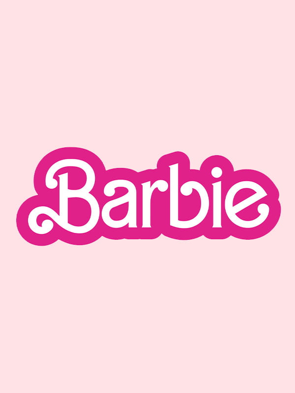
Good logos are relevant to the markets and target audience(s) the company is targeting. Therefore, a company that sells toys for children is more likely to choose bright, bold colors that convey energy, fun and joy. In addition to colors, font is also an important component to emphasize relevance. Fonts help convey the tone of your brand and its values, which ultimately helps better define your personality. Angular and thin fonts are ideal for highlighting a business in technology, while softer italic fonts are excellent for businesses selling jewelry or feminine products. A good example of a relevant logo is Barbie’s logo, which uses both a playful font and the feminine and cheerful color pink.
3. Memorable
If you want people to recognize your logo after just one glance, it is crucial to create a unique and memorable design that leaves a lasting impression. Memorable logos combine many of the elements already discussed, while finding the perfect balance between visual and textual aspects. More importantly, they clearly communicate the personality and tone of the brand. Finally, a memorable logo should always strive for uniqueness. It should stand out or contain a clever element that makes it truly distinctive. Examples of memorable logos include DuoLingo (featuring a recognizable mascot), bunq or Odido (combining vibrant colors with an ambigram – if you turn the logo over or look at it in a mirror, the same word remains visible), and Starbucks (an excellent example of an “emblem” logo).


4. Timeless
5. Versatile
Last but certainly not least, a good logo should be flexible and adapt effortlessly to different formats and situations. For example, a logo that only looks good online in one particular size is not optimal. Even if a logo looks great, that does not automatically mean it is good if it becomes unreadable or unrecognizable when reduced in size, such as on packaging, for example, or distorted for a billboard, for example. Logos are therefore always designed as vector files, keeping them sharp regardless of the scale at which they are displayed.
Many lines, embellishments, elements or colors can result in a complex design that is not applicable everywhere. Instead, it is advisable to think about the limited space available and focus on conveying more with less. Many of the previously mentioned logos serve as excellent examples of versatility. The most versatile logos also tend to be the simpler ones, think Nike, Apple and McDonald’s logos.


Are you in need of a new logo?
Sander has 25 years of experience conceiving and executing branding & marketing campaigns, including logo and corporate identity projects. Are you looking for support and want to know how he can help you? Then get in touch.


